Facilitating a personalized mindfulness experience; adding two new features to the popular meditation app.

Headspace App
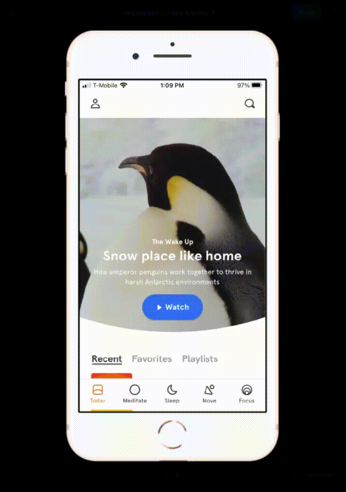
The Headspace app offers an array of meditations, sleep stories, focus music, in the form of single sessions and guided courses. The company was interested in* adding 1-2 new features, to improve the experience for existing users as well as entice potential new customers.
*This is a conceptual project & not officially affiliated with Headspace.
Project Scope: Feature addition to existing app
Role: UX Designer, Researcher, UI Designer
When: 2021
Tools: Figma, Photoshop, Illustrator, Miro, Maze, social media, in-person conversations, paper & pencil/marker

01/Research & Discovery
Company Background
Headspace was founded in 2010, by Andy Puddicombe and Rich Pierson, combining their respective expertise as an ordained monk (Andy) and marketing/new brand development (Rich). It began as an events company based in London, offering talks and events on mindfulness. They shifted their focus to developing a mobile app as a response to demand from the attendees of their events.
Competitive Landscape
Headspace is currently the second most popular meditation app; Calm (also a meditation app) has consistently been #1 since 2017. For reference, Headspace posted $100m in revenue for 2019; Calm posted $150m. I conducted an in-depth analysis of the top mindfulness apps on the market (Headspace & 5 other apps) to compare features, content, visual design, and more. I found that 5 out of 6 apps had the option to favorite sessions or create playlists (or both!) and Headspace was the only app that did not offer one of these two capabilities.
Problem Validation
Since I was not actually working with Headspace, I wanted to find another way to make sure my feature adds were grounded in true user needs and desires. I assessed what I personally thought could improve the app, then cross referenced that with reviews on the App Store & Google Play, comments on the Headspace Subreddit, and Twitter. This search confirmed my assessment, to add Favorites & Playlists to the app! A small sampling of reviews and comments regarding these desired features are below. Additionally, my decision to add these features was further validated when, shortly after I completed this project, Headspace added favorites to their app.
02/Define
Storyboard
The narrative illustrated by this storyboard shows Devon; a Headspace user who loves the app but finds all of the session options overwhelming. She would love to spend less time searching for a meditation session and more time actually meditating! This lays out a case for adding the ability favorite session and create playlists, showcases a few frustration points (limited time, overwhelm, desire for consistency), and points to a strong business case for adding favorites and playlists to the app: helping people become longterm users of the app.
Persona
Next I created a persona for Devon, which I returned to regularly to guide design choices.
Task Flow
I created a task flow to explore the various ways Devon might interact with the app once the ability to favorite/save sessions and compile playlists have been created. This process provided me with valuable insight into the information architecture and how I might integrate the new features into the existing app.
App Map
One of my goals/challenges in adding the 2 features to the existing Headspace app was to integrate the features into the current design and information architecture. Initially, I identified two main strategies and locations for the features: on the home/”today” screen and under the “profile”.
03/Design

Low-fidelity sketches & wireframes
Once I had a clear idea of who I was designing for, the flow, and information architecture of the app, I created low-fidelity sketches and wireframes.
High-Fidelity Wireframes


04/UI & Branding
This project did not require the creation of a design system from scratch, as the UI elements & visual branding are firmly established. I made a UI Kit to help me design features that fit into the current design system as seamlessly as possible.
Headspace has been very intentional over the years to help make mediation inclusive, accessible, and separate it from mystical, cliche imagery that can be hard to relate to. Their logo is an imperfect, orange (hex# F06E1D) dot, which represents the imperfect nature of the mind, the feeling of being centered and calm, as well as a nod to the harmonious nature of the color orange.
UI Kit
05/Usability Testing & Final Prototype
I knew that introducing 2 new features to both existing and new users of the Headspace app would be a challenge. I wanted to walk a fine line between maintaining the design of the app, which is quite spacious with lots of white space, and making it clear to users where they could find the new features. I chose to test the more simple version of my designs, in which a user uses a library icon to find both the favorites and playlists. I knew this design choice was somewhat risky, as some users would be familiar with the library icon from other apps but others would not. I thought enough participants would be familiar with the library icon to make this approach work, but I learned from the testing that my assumption was not correct.
Methodology
I conducted remote, self-guided usability testing, using the Maze usability testing software. I recruited participants through several channels: the headspace subreddit, my personal network, and Twitter. I wanted a mix of current Headspace users and people who have never used the Headspace app. A total of 23 participants completed the usability tests.

Find the “favorites” section of the app.

Find the “playlists” section of the app.

Favorite a session.

Add a session to a playlist.
Key Insights-
Round 1 of Testing
My assumptions, after running these tests, are that the favorites + playlists were not intuitive for all participants. Some participants expected to see a heart icon on the top navigation bar; some expected the favorites and playlists to be located under the existing profile icon. This suggests two different directions for me to take on the next iterations; perhaps A/B testing would be most appropriate at this point. Below are the main insights gathered from the tests, which I addressed in iterations for the next testing round.

Finding the favorites icon, and location of, the favorited sessions, was difficult for most participants.

Several participants commented that they were expecting more definitive confirmation for additions and changes to playlists.

The library icon wasn’t where participants were expecting to find the playlists & favorites.

Key Insights-
Round 2 of Testing
For the 2nd round of testing, I recruited 18 participants. Each participant was provided with one of two options, so that I could test two different directions to head for the locations of the new features. The option that was easiest to find for the participants (“Option A” above) was then iterated upon to come up with the final wireframes and protoype.
Final high-fidelity wireframes:

06/Reflections & Next Steps
Working on a project with an existing design system was incredibly fun and I appreciated the challenge of designing within clearly set constraints. Ditto for constructing the design system for the existing Headspace App; this exercise required me to examine the design of the app with such a high level or detail and attention that I was able to gain a very intimate understanding of the design system.
Were I to continue working on this project, my next steps would be:

Test a “swipe to delete” pattern for playlists + favorited sessions.

Additional tests and iterations for screens that allow editing capabilities for playlists.

All screens of the app design conform to WCAG at level AAA; however, I would like to conduct a usability test to determine if the accessibility of the new features can be improved upon.